Introduction
This is my reworked assignment after having received my feedback from my tutor.
Things that worked well:
- My images were well composed made extensive use of leading lines to draw eye through the image.
- I achieved a consistency across the set of images in terms of the tone and overarching background.
- Additional shots in the contact sheets were worthy of inclusion the set, in fact would have better in some cases.
Things that didn’t work so well:
- My set of images were largely landscape orientation, with one image being in portrait. This created an inconsistency, especially when viewed in the online gallery as it causes the screen to jump as it changes shape.
- Too many images were different scenes but of the same nature, essentially with pathways or roads running up through the middle of the image. As a set, this becomes tedious.
Changes from Original
There are a number of changes that I have made in response to the feedback that I received. All of the feedback that I received related to the editing of the set rather than to the specific images that I had created.
The changes that I have incorporated are:
- In the original set, one of my images was portrait orientation and the remainer landscape. The set now contains only landscape images in order to create a more cohesive set.
- Three of the images in my original set were different in scene but were all made up of a classical landscape scene with a path / road / frozen stream all running up through the middle of them. There were too alike. I have removed two of those images and instead have inserted different images from my contact sheet which contained images from inside my home. This is now a more intimate set and the images are more diverse.
- I changed out one of the forest scenes even though it was different in its composition. I felt that three forrest scenes were too much alike.
- I have made the images on the page larger to allow them to be seen more easily.
- I have created a composite image of the nine images in my set that shows them in a layout that represents how I would intend to present them in a physical presentation.
Gallery of Images


")
")
")

")

")
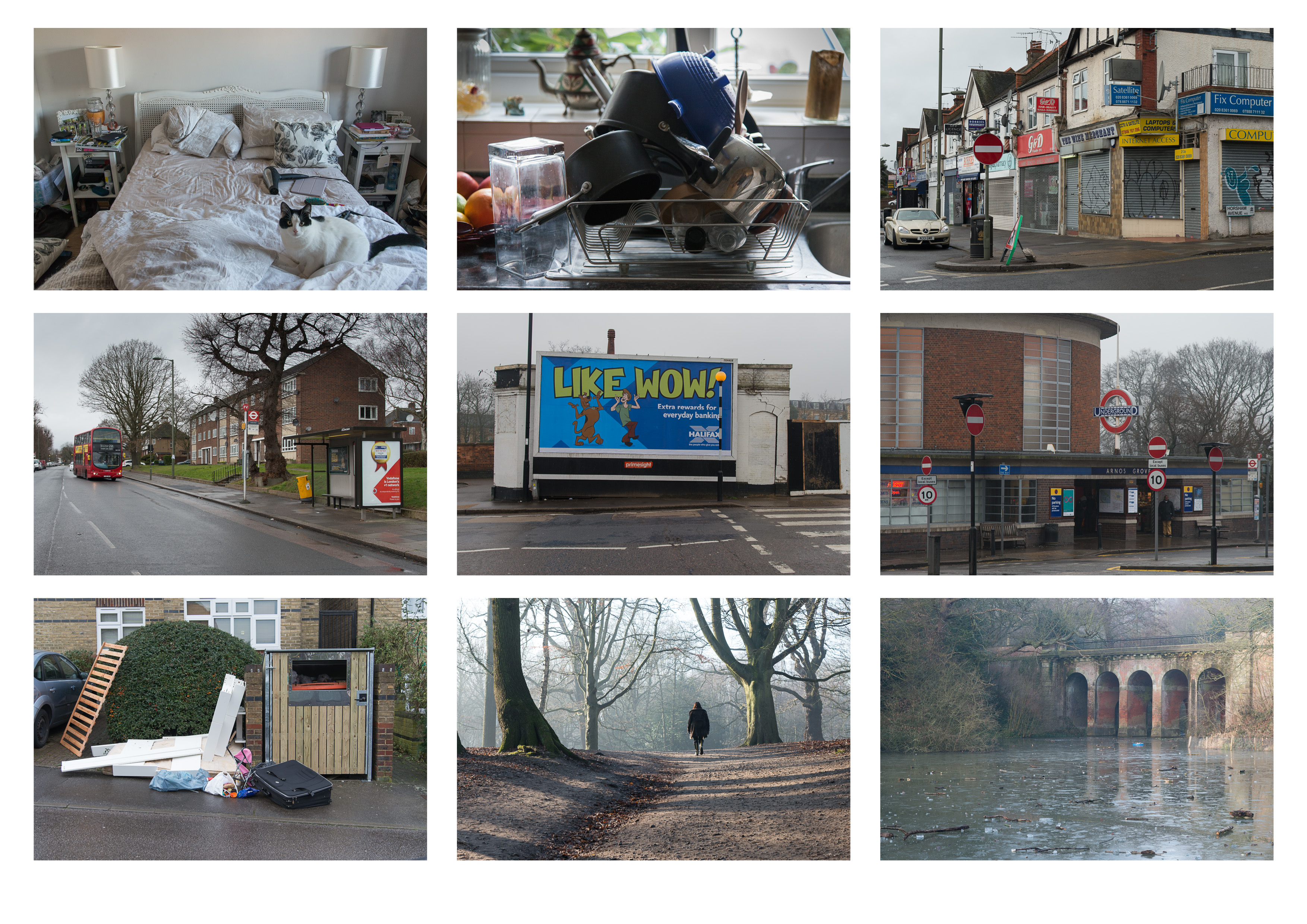
Presentation Layout
The image below represents the layout I would use in a physical presentation.
Assessment of Rework
I am very happy with the differences that these changes make, I have come to understand just how critical editing and image selection is to the creation of an impactful set of images, rather than a collection. There is a big difference.
I am now left with the feeling that as a set of images, the forrest scenes feel slightly out of place compared to the rest of the images however being able to walk in the forrest and parks around my area is one of the key things that I have enjoyed since being back in the UK and I feel it is important to include an acknowledgement of that within the spirit of this exercise and therefore within the set of images.
All of the changes listed in the bullet points earlier in this post have had an effect and it has certainly given me much food for thought as I prepare future assignments.